In 1999, Pantone announced its first color of the year. Since then, all the major paint companies have jumped on board the COTY train. To make their selections, they analyze trends, from interior design to product design to fashion, and even the entertainment industry. Whether it’s really possible to distill our entire culture down to a single emblematic hue is open to debate. What’s certain is that it’s a lot of fun to see what these companies predict will be trending in the new year. In this post, I will run down all the major 2020 COTY selections. Just for fun, I’ve asked everyone on the CRD design team to pick which they like best. Let’s get started!
Behr 2020 Color of the Year

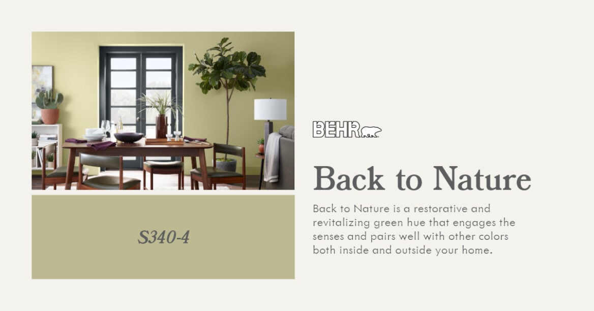
Behr’s 2020 color of the year is “Back to Nature,” a light green shade they describe as calm, gracious, and balanced.
Behr 2020 Color Trends Palette
In addition to announcing a single COTY, Behr has unveiled an entire palette of complementary colors. Here’s how they describe their selections:
The Behr 2020 Color Trends palette was inspired by natural elements such as sky, earth, water and plant life. Seasonal changes and world exploration also play a role in how we relate to color. Each hue was selected to work well alone or in combination to create a unique look for your home and style.


See also: A Primer on Paint
Benjamin Moore 2020 Color of the Year

Benjamin Moore’s color of the year is “First Light,” which the company describes as “a soft, rosy hue blooming with potential.” To my eye, it’s a light shade of pink with subtle blue undertones. Unlike the ubiquitous “millennial pink,” which was all the rage in 2016 and hasn’t really gone away yet, First Light is a pretty pink without the ironic detachment.
Benjamin Moore Color Trends 2020 Palette
Like Behr, Benjamin Moore announced their color of the year as part of a palette of ten colors “that combine optimism with understatement, a timeless way to lighten up.”


Sherwin Williams 2020 Color of the Year

“Naval” is a navy blue that draws inspiration from both nature and the opulence of the Art Deco period. According to Sherwin Williams, it is ” a rich navy that creates a calm and grounding environment infused with quiet confidence.” I like it because it seems like it would complement both minimalist and maximalist decors equally well. It would lend a calming presence when paired with organic materials, or it could be glammed up with bright brass or chrome accents and bold patterns.
Valspar 2020 Colors of the Year

Apparently Valspar couldn’t narrow it down to a single color, so they announced 12 colors of the year. It is a palette of neutrals that the company says was inspired by nature. “Do-it-yourselfers are craving colors found in nature that are subdued and livable — improvements on paint colors they already have in their homes.” I can’t recall seeing colors like the mint green “Mint Whisper” in nature, but okay. With pinks, blues, earth tones, and several shades of green, perhaps the real story here is that do-it-yourselfers are expanding their idea of what a neutral is and embracing a wider range of colors.
Farrow & Ball’s 2020 Color Collection

F&B didn’t jump on the COTY bandwagon, but they did release a new collection of 16 colors that were inspired by—you guessed it—nature. Their “Colour by Nature” collection was part of their collaboration with the Natural History Museum in London. The colors range from soft off-whites and neutrals to slightly mellowed out versions of mineral tones, like “Emerald Green” and “Verdigris Green.”
Pantone 2020 Color of the Year

Pantone just released their color of the year for 2020: Classic Blue. Pantone states that it is inspired by the color of the sky at dusk. Despite its natural roots, it stands in stark contrast to 2019’s color of the year, Living Coral. Classic Blue is a safer, more reassuring shade, perhaps picked to offer comfort during tumultuous times. Pantone sums up the feeling of reassurance the color brings to today’s hectic human experience:
As technology continues to race ahead of the human ability to process it all, it is easy to understand why we gravitate to colors that are honest and offer the promise of protection. Non-aggressive and easily relatable, the trusted PANTONE 19-4052 Classic Blue lends itself to relaxed interaction. Associated with the return of another day, this universal favorite is comfortably embraced.
Despite the flowery language, I think they’re on to something! It’s almost impossible to look at this color and not feel calmer and perhaps a bit uplifted.
In its pure form, Classic Blue probably will be relegated to more of an accent color in homes, but look for this pure, “honest” blue to influence interior design in the coming year. It’s a color that is both classic and bold, in that it eschews the grayed-out, pastel tones of some of the other colors of the year.
Our picks of the palettes
After reviewing the COTY choices from all the major paint brands, it’s clear that soft neutrals and nature-inspired will continue to rise in dominance. Just for fun, I took an informal poll among my designer colleagues here at CRD, and here are our picks from all the offerings above.
See also: Create a Home That’s Timeless, Not Trendy

Megan Knight
Battleship Gray by Behr
The term “gray is the new beige” never felt truer than with Battleship Gray (Behr N360-4). This color is a perfect neutral with which you can pair warm or cool tones and a color value that creates a sense of cozy warmth to any room.


Morgan Bishop
Crimson Red by Farrow & Ball
I’m loving that pinks are making a comeback, especially the earthy hues. My vote is for the Farrow & Ball Crimson Red—a deep, warm pink that feels inviting and playful. Paired with soft creamy white accents and rich wood tones, this is a trend I can get behind.


Leslie Eiler
White Heron by Benjamin Moore
I love that the warm off-whites are coming back! No more sterile, harsh white paint! White Heron brings in just enough warmth to be neither beige nor gray; it’s sophisticated, chic, and versatile. I’d use this color in a contemporary space for everything—walls, ceiling, door, and trim!

Planning a remodel?
There’s much more to creating great interiors than just choosing the right paint colors. Thoughtful design plays a huge role in creating a space you will love for many years to come. If you are contemplating a Seattle remodel, please feel free to reach out. My interior designer colleagues and I would be happy to answer your questions and share our ideas.